How to Make Your GHL Funnel Look Professional (Even If You Are Not a Designer)
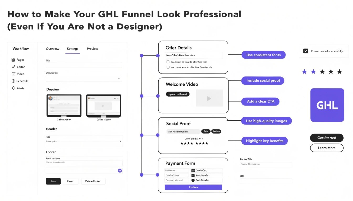
Does your GoHighLevel (GHL) funnel look a bit “DIY”? Many coaches build their own pages, but the final result can look generic or messy. You don’t need to be a professional designer to have a high-end website. By using a few simple GHL CSS tweaks, you can turn a basic template into a premium sales machine.
In this guide, we will share five easy design secrets to help you look like an authority in your niche. To see these tips in action, check out our GHL Funnel Examples for visual inspiration.
Why Design Matters for Coaches
As a coach, your website is your digital storefront. If it looks cheap, potential clients might think your coaching is low-quality too. A professional design builds instant trust and makes it easier for you to charge higher prices.
Key Elements of Professional Design:
Standard GHL Design vs. Professional Custom Design
| Feature | Standard “DIY” Look | Professional CSS Look |
| Buttons | Square & Flat | Rounded with Glow Effects |
| Spacing | Tight & Cluttered | Balanced & Organized |
| Colors | Default Blue/Grey | Brand-Matched Gradients |
| Trust Signals | Plain Text Testimonials | Styled Review Cards |
5 Simple CSS Fixes for a Professional Look
You can copy and paste these snippets into your Funnel Settings > Custom CSS to see an immediate upgrade.
1. Add “Breathable” Spacing to Sections
Standard sections can feel cramped. Use this to add consistent padding.
CSS
.inner {
  padding-top: 80px !important;
  padding-bottom: 80px !important;
}
2. Create a Modern Hero Gradient
Instead of a flat background, use a soft gradient to make your headline “pop.”
CSS
#section-hero-id {
  background: linear-gradient(135deg, #f5f7fa 0%, #c3cfe2 100%) !important;
}
3. Style Your Testimonials
Make your client feedback look like professional review cards.
CSS
.testimonial-card {
  border-radius: 15px !important;
  box-shadow: 0 10px 30px rgba(0,0,0,0.05) !important;
  border: 1px solid #eee !important;
}
The Secret of Visual Hierarchy
A professional funnel guides the user’s eye. Your most important information (like your headline and your GHL CSS Buttons) should be the brightest and largest items on the page.
Mobile Design is Not Optional
Most of your clients will find you on their phones. A funnel that looks good on desktop might break on mobile. Always follow a GHL Mobile Responsive Guide to ensure your professional look stays perfect on every screen size.
Pro Tip for Coaches:
If your funnel still feels “stuck,” you don’t have to do it alone. You can request a specific CSS Snippet Fix for just $47 to solve your biggest design headache in 24 hours.
Frequently Asked Questions (FAQs)
Do I need to learn coding to look professional?
No. You only need to know how to copy and paste specific snippets that do the hard work for you.
What is the best color for a coaching funnel?
Blue and green often signal trust and growth. However, the best color is always the one that matches your personal brand.
How do I fix overlapping text on mobile?
This usually happens when font sizes are too large. You can use a “Media Query” to lower the font size specifically for mobile devices.
Conclusion
Making your GHL funnel look professional is about the small details. By adding better spacing, custom fonts, and consistent colors, you move from “just another coach” to a “must-hire authority.” Start with one section today and watch how your confidence—and your conversions—grow.