GHL CSS Sticky Headers: How to Keep Your Navigation in View
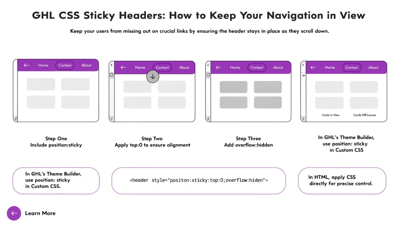
Do you have a long landing page in GoHighLevel (GHL)? When users scroll down, they often lose sight of your logo and your main “Buy Now” button. By using GHL CSS, you can create a “Sticky Header” that stays at the top of the screen as the user moves.
In this guide, we will show you how to lock your navigation bar in place. This small change makes your site feel like a custom-coded app and keeps your GHL CSS Buttons always ready to be clicked.
Why Use a Sticky Header in GHL?
A sticky header improves “User Flow.” It means the user never has to scroll all the way back up to find the menu. This is especially helpful for mobile users on small screens.
Benefits of Sticky Elements:
- Higher Engagement: Your menu links are always visible.
- Brand Awareness: Your logo stays in the user’s line of sight.
- Professional Feel: Most premium SaaS websites use sticky navigation.
- Better UX: It pairs perfectly with a GHL Mobile Responsive Guide setup.
Where to Add the Sticky CSS Code
To make a section sticky, you should add the code to your funnel’s Settings > Custom CSS. You will need to target the specific section or row that holds your navigation menu.
Static Headers vs. Sticky Headers
| Feature | Static Header | Sticky Header (Custom CSS) |
| Visibility | Disappears on scroll | Always visible at the top |
| Navigation | User must scroll up | One-click access to menu |
| CTA Access | Limited | Permanent |
| Page Speed | Same | Same |
Essential CSS Snippets for Sticky Elements
Copy these codes into your GHL CSS box to lock your elements in place.
1. Basic Sticky Header
Find the CSS ID for your top section (e.g., #section-123) and use this code:
CSS
#section-123 {
  position: sticky !important;
  top: 0 !important;
  z-index: 999 !important;
  background-color: #ffffff !important;
}
2. Sticky Floating Button (Mobile)
Want a “Call Now” button that stays at the bottom of the phone screen?
CSS
@media only screen and (max-width: 767px) {
  .floating-button {
    position: fixed !important;
    bottom: 20px !important;
    right: 20px !important;
    z-index: 1000 !important;
  }
}
3. Adding a “Shadow” to the Sticky Header
This makes the header look like it is floating above the rest of the content.
CSS
.sticky-header-class {
  box-shadow: 0 4px 6px -1px rgba(0, 0, 0, 0.1) !important;
}
How to Avoid “Z-Index” Issues
When you make something sticky, it might sometimes hide behind other images or videos on the page. This is a Z-Index problem.
- Think of Z-Index as layers of paper.
- Your sticky header needs to be the “top layer.”
- Always set your sticky element’s
z-indexto a high number like999to keep it on top of everything else.
Best Practices for Sticky Design
Keep it Small
A sticky header should not take up half the screen. Keep it thin so there is plenty of room for the user to read your main content.
Use Transparency
Sometimes a 100% solid color header can feel heavy. Try using a slightly transparent background (RGBA) so the user can see the content moving behind the header.
Mobile Testing
On a phone, a sticky header can take up a lot of space. Use your GHL CSS Selectors knowledge to make the header smaller or hide it completely on very small screens if it blocks the view.
Frequently Asked Questions (FAQs)
Can I make a single row sticky instead of a whole section?
Yes. You can target a Row ID or a Column ID just like you target a Section ID.
Does a sticky header slow down my page?
No. This is a simple CSS property that does not affect your page load speed at all.
Can I make a sidebar sticky?
Yes! If you have a long blog post, you can make the sidebar (with your lead form) stay in place while the user reads the article.
Conclusion
Adding a GHL sticky header is a simple way to make your funnels more user-friendly. It keeps your important links and buttons within reach at all times. Start by locking your top navigation today and see how it changes the feel of your landing page!