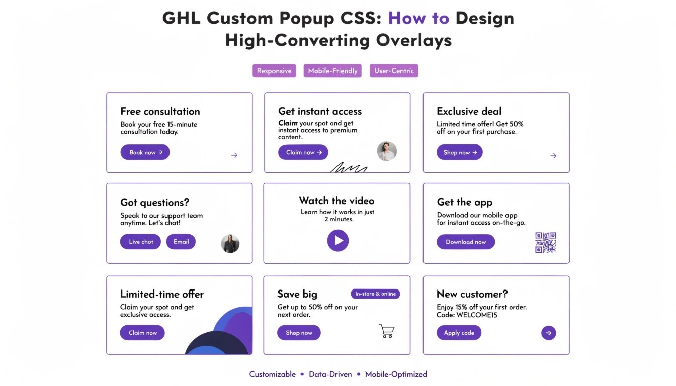
GHL Custom Popup CSS: How to Design High-Converting Overlays
Do you want your GoHighLevel (GHL) popups to stop being ignored? Most popups look like a basic box that gets in the way of the user. By using GHL CSS, you can transform your popups into beautiful, modern overlays that match your brand perfectly.
In this guide, we will show you how to style the popup background, add rounded corners, and create custom exit animations. This is a perfect follow-up to our guide on GHL CSS Button Styling to ensure your popup’s CTA looks premium.
Why Customize Your GHL Popups?
Popups are one of the best ways to capture leads, but only if they look trustworthy. A custom-designed popup makes your offer feel more valuable.
Benefits of Custom Popups:
Where to Add CSS for GHL Popups
GHL popups live on your funnel page. To style them:
Standard GHL Popup vs. Custom CSS Popup
| Feature | Standard GHL Popup | Custom CSS Popup |
| Shape | Square Corners | Smooth Rounded Edges |
| Overlay | Solid Grey/Black | Blurred “Glass” Overlay |
| Border | Thin Black Line | Neon Glow or No Border |
| Animation | Simple Fade | Slide-in or Bounce Effects |
Essential GHL CSS Snippets for Popups
Copy these codes into your CSS box to upgrade your popup design instantly.
1. Rounded Popup Corners
This makes the main popup box look much softer and more modern.
CSS
.modal-content {
  border-radius: 25px !important;
  border: none !important;
  overflow: hidden !important;
}
2. The “Glass” Overlay Effect
This blurs the website content behind the popup so the user focuses only on your offer.
CSS
.modal-backdrop {
  background-color: rgba(0, 0, 0, 0.4) !important;
  backdrop-filter: blur(8px) !important;
  -webkit-backdrop-filter: blur(8px) !important;
}
3. Styling the Close Button (X)
Make the close button easier to see or hide it until the user has read your headline.
CSS
.close-modal {
  color: #7C3AED !important;
  font-size: 24px !important;
  font-weight: bold !important;
}
Best Practices for Popup Design
Use “Mobile-First” Logic
Popups can be annoying on a phone if they cover the whole screen. Use our GHL Mobile Responsive Guide to make sure your popup is smaller and easy to close on a smartphone.
Don’t Block the Content
Make sure your popup only appears when it provides value. If you use a sticky header, ensure the popup doesn’t clash with it.
Focus on the Headline
Your popup headline should be the largest text. Use your GHL Custom Fonts to make the headline stand out and match your brand’s voice.
Frequently Asked Questions (FAQs)
Can I make the popup slide in from the side?
Yes. You can use CSS “Keyframes” to create a slide-in animation instead of the standard fade-in.
How do I change the color of the popup overlay?
In the code snippet above, you can change the rgba numbers to any color you like (e.g., a dark blue or your brand color).
Will these styles affect all my popups?
Yes, if you put the code in the Global CSS box. To target just one popup, you can use the specific Page Settings CSS box.
Conclusion
Customizing your GHL Popups with CSS is a simple way to increase your conversion rate. When an overlay looks professional and clean, users are more likely to stay and read your offer. Try adding a background blur and rounded corners today to see how much better your funnels look!