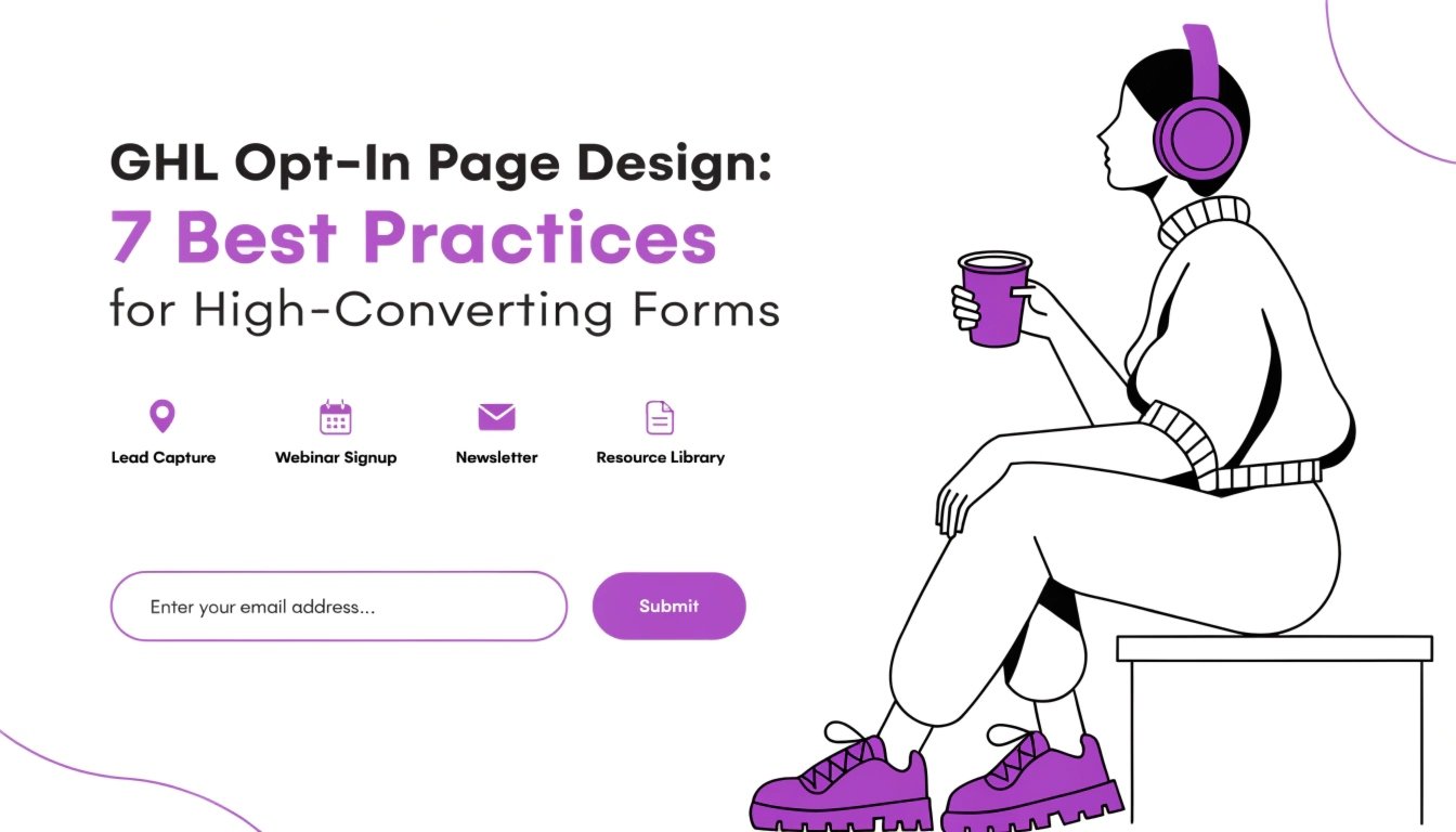
GHL Opt-In Page Design: 7 Best Practices for High-Converting Forms
Are you struggling to get people to sign up for your lead magnet? Your GoHighLevel (GHL) opt-in page is the most important part of your marketing. If it looks cluttered or “standard,” visitors will bounce without giving you their email. By using clean design and targeted GHL CSS, you can create a page that builds instant trust.
In this guide, we will show you how to move from a basic template to a high-converting opt-in page. To see how professional design can change your results, read our guide on how to make your GHL funnel look professional.
Why Opt-In Design is Critical for Coaches
For a coach, an opt-in page isn’t just about a form; it is about the “First Impression.” You are asking for a piece of their personal information. A design that is clean, fast, and mobile-friendly tells the user that your coaching is also high-quality.
Features of a Winning Opt-In Page:
Standard GHL Opt-In vs. Optimized CSS Design
| Feature | Standard GHL Opt-In | Optimized CSS Opt-In |
| Form Fields | Simple white boxes | GHL Custom Forms with glow effects |
| Main Heading | System fonts | Branded GHL Custom Fonts |
| CTA Button | Flat and static | Animated GHL CSS Buttons |
| Trust Signals | Plain text | Styled cards with soft shadows |
3 Quick CSS Fixes for Your Opt-In Page
Copy and paste these snippets into your Page Settings > Custom CSS to see an immediate boost in visual quality.
1. Remove the “White Box” Around Forms
Standard GHL forms often have a border that doesn’t match the background. This code blends it perfectly.
CSS
.ghl-form {
  background: transparent !important;
  border: none !important;
}
2. Make Your Opt-In Headline Bold
Use this to make your “Big Promise” stand out and grab attention.
CSS
.elHeadline {
  font-weight: 800 !important;
  letter-spacing: -1px !important;
  line-height: 1.2 !important;
}
3. Add a Modern Shadow to Your Form Container
This makes the form “pop” off the page so the user knows where to look.
CSS
.form-container {
  box-shadow: 0 20px 40px rgba(0,0,0,0.1) !important;
  border-radius: 15px !important;
}
The “F-Pattern” of Design
Research shows that users read websites in an “F” pattern.
By placing your GHL CSS Buttons on the right side or centered with a bright color, you follow the natural way people read, leading to more sign-ups.
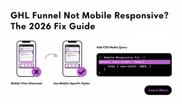
Mobile Testing for Your Opt-In
On a computer, your form might be on the right. On a phone, it will stack to the bottom. If your headline is too long, the user might never even see the form! Always use our GHL Mobile Responsive Guide to adjust your font sizes so the “Email” field is visible on the first screen of a phone.
Pro Tip for Faster Launches:
If you are tired of fighting with the builder, you can get a Sales Page CSS Upgrade for just $147. We will handle the typography, hero section, and mobile polish for you in 3 days.
Frequently Asked Questions (FAQs)
Should I ask for a phone number on my opt-in?
Every field you add reduces your conversion rate. For a free lead magnet, only ask for Name and Email. Save the phone number for the application page.
Can I use a video background on my opt-in?
Yes, but be careful. It can slow down your page. If you use one, add a dark overlay with GHL Glassmorphism to keep the text readable.
How do I change the color of the “Privacy Policy” link?
You can target the footer links specifically in your CSS so they don’t distract from the main “Submit” button.
Conclusion
A high-converting GHL opt-in page is the foundation of your coaching business. By focusing on simple fonts, high-contrast buttons, and mobile responsiveness, you can double your lead flow overnight. Start by cleaning up your form container today and watch your email list grow!