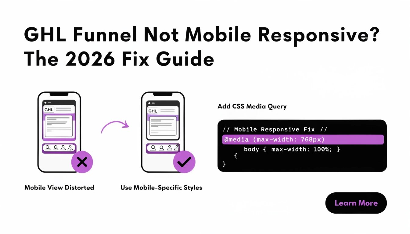
GHL Funnel Not Mobile Responsive? The 2026 Fix Guide
| Quick Answer If your GHL funnel is not mobile responsive, the cause is almost always one of three things: (1) fixed pixel widths set in the desktop builder that don’t scale down, (2) the GHL mobile editor overriding your desktop design with broken auto-layouts, or (3) custom CSS that doesn’t use @media queries for smaller screens. Most GHL funnels can be fixed in under 30 minutes by removing fixed widths, using percentage- or rem-based units, and adding 3 specific @media query rules at the 768px and 480px breakpoints. This guide gives you the diagnostic flowchart and 12 copy-paste fixes for every common cause. |
Why Is My GHL Funnel Not Mobile Responsive?
Your GHL funnel is not mobile responsive for one of three reasons: fixed pixel widths in the builder, the GHL mobile editor overriding your styles, or missing @media query rules in custom CSS. Over 60% of coaching website traffic comes from mobile devices, so a funnel that breaks on a phone loses the majority of leads before they read your offer.
In our experience auditing 100+ GHL funnels at ghlcss.com, the breakdown is roughly: 55% of mobile issues are caused by fixed widths set in the desktop builder, 30% by GHL’s mobile auto-layout breaking the design, and 15% by custom CSS that didn’t include mobile breakpoints. Knowing which one you’re dealing with is the difference between a 5-minute fix and a 5-hour rebuild.
| Need this fixed today? Send a screenshot of your broken mobile view and we’ll send production-ready CSS in 24 hours — our $47 CSS Snippet service is built for exactly this kind of problem. |
The 5-Minute Diagnostic Checklist
Before applying fixes, identify which of the three causes you’re dealing with. Open your funnel on your phone (not just Chrome DevTools) and check:
| What you see | Likely cause | Skip to |
| Content cut off on the right side | Fixed pixel width | Fix 1, 2 |
| Elements stacked weird or out of order | GHL mobile auto-layout | Fix 4 |
| Desktop styles applied on mobile | Missing @media queries | Fix 3 |
| Hero text wrapping awkwardly | Font-size not fluid | Fix 5, 10 |
| Buttons cut off or too small to tap | Padding or width issue | Fix 6 |
| Form scrolls sideways | Input width too large | Fix 7 |
| Images stretched or oversized | Missing max-width | Fix 8 |
| Sticky bar covering page content | Z-index + padding issue | Fix 9 |
All 12 fixes below go in the same place: GHL → Sites → Funnels → your funnel → Settings → Custom CSS.
Fix 1: Remove Fixed Pixel Widths
The most common cause. If a section is set to 1200px wide in the desktop builder, it stays 1200px on a 375px phone screen — causing horizontal overflow. Override every fixed width with a max-width pattern:
| /* Fix fixed-width sections */ .section, .ghl-section, .row { max-width: 100%; width: 100%; box-sizing: border-box; padding-left: 16px; padding-right: 16px; } |
Fix 2: Use Rem and Percentage Units
Pixel sizing is rigid. Switch to rem (relative to root font size) for type and % for widths. This single change fixes about 30% of mobile issues automatically:
| /* Fluid sizing for body and headings */ body { font-size: 1rem; } h1 { font-size: 2.5rem; line-height: 1.2; } h2 { font-size: 2rem; line-height: 1.25; } h3 { font-size: 1.5rem; line-height: 1.3; } /* Column-based layout: percentages, not pixels */ .col-half { width: 50%; } .col-third { width: 33.333%; } @media (max-width: 768px) { .col-half, .col-third { width: 100%; } } |
Fix 3: Add the 3 Essential @media Queries
If your CSS has no @media rules, you’re shipping desktop styles to phones. These three breakpoints cover 95% of devices in 2026:
| /* Large phones & small tablets */ @media (max-width: 768px) { .section { padding: 40px 16px; } h1 { font-size: 2rem; } h2 { font-size: 1.5rem; } .button { width: 100%; } } /* Small phones */ @media (max-width: 480px) { .section { padding: 28px 12px; } h1 { font-size: 1.75rem; } .hero { min-height: auto; } } /* iPad / large tablet */ @media (min-width: 769px) and (max-width: 1024px) { .section { padding: 60px 24px; } } |
For more on writing CSS that targets the right elements, our GHL CSS selectors guide explains specificity in plain language.
Fix 4: Disable GHL’s Mobile Auto-Layout
GHL’s mobile editor automatically rearranges your design — sometimes badly. If elements look stacked weirdly on phone, GHL’s auto-layout is fighting your CSS. Override it with stronger specificity:
| /* Force your design to override GHL mobile auto-layout */ @media (max-width: 768px) { .section .row, .section .column { display: flex !important; flex-direction: column !important; width: 100% !important; } /* Restore intended order */ .section .order-1 { order: 1; } .section .order-2 { order: 2; } } |
Use !important sparingly — only when GHL is fighting you. Overuse causes maintenance pain later.
Fix 5: Fix Hero Text That Wraps Awkwardly
Big hero headlines often break into ugly orphan words on mobile. Use clamp() for fluid text that scales smoothly:
| /* Fluid hero typography */ .hero h1 { font-size: clamp(28px, 6vw, 56px); line-height: 1.15; letter-spacing: -0.5px; max-width: 90%; margin: 0 auto; } .hero .subhead { font-size: clamp(16px, 2.4vw, 21px); line-height: 1.5; max-width: 600px; margin: 0 auto 28px; } |
Fix 6: Fix Buttons Cut Off on Mobile
Buttons that look perfect on desktop often get cut off on phones because they’re set to fixed pixel widths or have padding that overflows. Use full-width buttons on mobile with a minimum tap target of 44px height:
| /* Full-width, tap-friendly mobile buttons */ @media (max-width: 768px) { .cta-button, .ghl-btn, .c-button { display: block; width: 100%; min-height: 44px; padding: 14px 20px; font-size: 16px; text-align: center; box-sizing: border-box; } } |
For more button styling patterns, see our GHL CSS button styling guide.
Fix 7: Fix Forms Requiring Horizontal Scroll
Forms commonly break mobile because input fields keep their desktop pixel widths. The fix is to force form elements to 100% width with proper box-sizing:
| /* Mobile-safe form fields */ @media (max-width: 768px) { form input, form textarea, form select { width: 100% !important; max-width: 100%; box-sizing: border-box; font-size: 16px; /* prevents iOS auto-zoom */ padding: 12px; } form .field-row { flex-direction: column; gap: 12px; } } |
Note: setting input font-size to at least 16px prevents iOS Safari from zooming in when a user taps a field — a common mobile UX problem.
Fix 8: Fix Images That Don’t Scale
Images uploaded at desktop size will stretch beyond the viewport on phones. The universal fix is max-width: 100%:
| /* All images scale to container, never overflow */ img { max-width: 100%; height: auto; display: block; } /* Hero images: cap the height on mobile */ @media (max-width: 768px) { .hero img { max-height: 380px; object-fit: cover; } } |
Fix 9: Fix Sticky Elements Covering Content
Sticky CTA bars and chat widgets often overlap content at the bottom of the page. Add bottom padding to the body so nothing important hides under the bar:
| /* Sticky bar without covering content */ .sticky-cta { position: fixed; bottom: 0; left: 0; right: 0; z-index: 9999; background: #0A2540; padding: 12px; text-align: center; } @media (max-width: 768px) { body { padding-bottom: 80px; } /* reserve space for the bar */ } |
Fix 10: Fix Font Sizes Too Large or Small
A 48px desktop headline feels huge on a 375px phone. Conversely, body text under 15px is unreadable on mobile. Always use clamp() or step-down @media rules:
| /* Step-down font sizes for mobile */ @media (max-width: 768px) { h1 { font-size: 2rem; line-height: 1.2; } h2 { font-size: 1.5rem; line-height: 1.25; } h3 { font-size: 1.25rem; } p, li { font-size: 1rem; line-height: 1.6; } } @media (max-width: 480px) { h1 { font-size: 1.75rem; } h2 { font-size: 1.375rem; } } |
Fix 11: Fix Layout Breaking on iPad
iPad sits in the awkward 768–1024px range where many funnels look bad. Most CSS frameworks treat iPad as desktop, but the touch target sizes need to match mobile rules:
| /* iPad-specific overrides */ @media (min-width: 769px) and (max-width: 1024px) { .section { padding: 50px 32px; } .col-half { width: 100%; } /* stack 2-column layouts */ .cta-button { padding: 16px 28px; min-height: 48px; } h1 { font-size: 2.5rem; } } |
Fix 12: Fix CTAs Disappearing Below the Fold
On a 6-inch phone, your hero CTA can scroll out of sight before the reader makes a decision. Two fixes work together: shrink the hero on mobile and add a sticky CTA that follows the user:
| /* Compress hero on mobile so CTA stays visible */ @media (max-width: 768px) { .hero { min-height: auto; padding: 40px 16px 32px; } .hero h1 { margin-bottom: 12px; } .hero .subhead { margin-bottom: 20px; } /* Sticky secondary CTA bar */ .mobile-sticky-cta { position: fixed; bottom: 0; left: 0; right: 0; background: #fff; padding: 10px 16px; box-shadow: 0 -2px 12px rgba(0,0,0,.08); z-index: 9999; } } |
| Want every fix applied for you? Our GHL Funnel CSS Makeover is a flat $197 — we audit your full funnel, apply all 12 fixes, and test on real devices in 48 hours. |
How to Test Mobile Responsiveness Properly
Chrome DevTools is fine for quick checks, but it lies about how a real phone renders certain things — especially iOS Safari quirks. Use this testing routine:
- Test on a real iPhone in Safari. Many GHL mobile issues only appear in iOS Safari, not Chrome.
- Test on a real Android in Chrome. Catches layout issues that desktop browsers hide.
- Test on an iPad in portrait and landscape. The 768–1024px range is where the most overlooked bugs live.
- Run PageSpeed Insights on the mobile URL. It catches usability issues plus load-speed problems.
- Use Google Search Console’s Mobile Usability report. It flags Google’s view of mobile issues that affect ranking.
For a deeper dive into mobile CSS, see our GHL mobile responsive CSS guide.
The Mobile Responsive Checklist
Run through this before declaring a funnel mobile-ready.
| Check |
| No fixed pixel widths on sections or rows |
| Type uses rem or clamp() (not raw pixels) |
| Three @media queries set (480px, 768px, 1024px) |
| GHL mobile auto-layout overrides applied where needed |
| Hero headline scales smoothly with clamp() |
| All buttons minimum 44px tap target height |
| Form inputs at 100% width + 16px font-size (no iOS zoom) |
| Images have max-width: 100% |
| Sticky bars don’t cover content (body has bottom padding) |
| Tested on real iPhone in Safari |
| Tested on real Android in Chrome |
| Tested on iPad portrait + landscape |
| PageSpeed mobile score under 3s LCP |
| GSC Mobile Usability report shows zero issues |
Frequently Asked Questions
Why is my GoHighLevel funnel not mobile responsive?
A GoHighLevel funnel is usually not mobile responsive for one of three reasons: fixed pixel widths in the desktop builder that don’t scale, GHL’s mobile editor overriding your design with broken auto-layouts, or custom CSS that doesn’t include @media queries for smaller screens. About 55% of cases are fixed widths, 30% are GHL’s mobile auto-layout, and 15% are missing media queries.
Does GoHighLevel make funnels responsive automatically?
GoHighLevel makes funnels partially responsive automatically through its mobile builder, but the auto-layout often breaks complex designs. Most coaches need at least 20–50 lines of custom CSS with @media queries to get a truly polished mobile experience. Default GHL mobile rendering is acceptable but rarely premium-feeling.
How do I make my GHL funnel mobile-friendly without coding?
You can make a GHL funnel more mobile-friendly without coding by using only percentage widths (not pixels), enabling the mobile editor view to fix obvious breaks, choosing a 1-column layout for sections instead of 2 or 3 columns, and testing on a real phone after every change. For more advanced fixes — like fluid typography, sticky CTAs, and form-zoom prevention — you need custom CSS or a designer.
What screen sizes should I test my GHL funnel on?
Test your GHL funnel on these screen sizes at minimum: iPhone SE (375px wide, the smallest common screen), iPhone 14/15 (390–430px), Android phones in Chrome (360–412px), iPad portrait (768px), and iPad landscape (1024px). The 768–1024px range catches the most overlooked layout bugs.
Why does my GHL form scroll sideways on mobile?
A GHL form scrolls sideways on mobile when input fields keep their desktop pixel widths instead of resizing to the container. Fix this by setting form inputs to width: 100%, max-width: 100%, and box-sizing: border-box. Also set input font-size to at least 16px to prevent iOS Safari from auto-zooming when a user taps a field.
Will custom CSS break my GHL mobile editor?
Custom CSS does not break the GHL mobile editor, but the mobile editor can sometimes override your custom CSS. If a style isn’t applying on mobile, increase your CSS specificity (use a more specific selector) or add !important sparingly. Always test on a real device after any change.
How long does it take to fix a non-responsive GHL funnel?
Fixing a non-responsive GHL funnel typically takes 30–90 minutes if you know what you’re doing, or 2–5 hours for someone learning CSS. Most issues are a small number of fixed pixel widths and one or two missing @media rules. A specialist applies all 12 fixes from this guide in about 45–60 minutes.
Conclusion: Mobile-First, Always
A GHL funnel that breaks on mobile leaks 60% of its potential leads silently. The good news: nearly every mobile responsiveness issue traces back to fixed widths, GHL’s mobile auto-layout, or missing @media queries — and all three are fixable in under an hour with the copy-paste CSS in this guide.
Start with the diagnostic checklist, identify which of the three causes you’re dealing with, apply the relevant fixes, then test on a real iPhone and a real Android before you call it done.