GHL CSS Mobile Responsive Guide: Fix Your Funnel Layouts
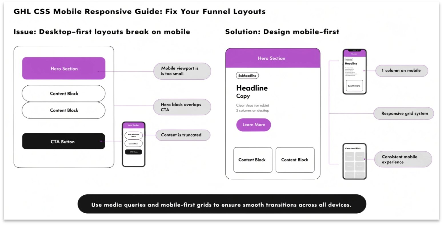
Does your GoHighLevel (GHL) funnel look great on a computer but messy on a phone? Even though GHL has a mobile builder, sometimes elements don’t align correctly. Using GHL CSS for mobile responsiveness allows you to hide, resize, or move elements specifically for mobile users.
In this guide, we will teach you how to use “Media Queries” to make sure your site looks professional on any screen size.
Why Mobile Responsiveness Matters
More than 60% of web traffic comes from mobile devices. If your “Buy Now” button is too small or your text is overlapping, you will lose sales. A responsive site is also better for SEO, as search engines like Google rank mobile-friendly pages higher.
Benefits of Responsive CSS:
- Better User Experience: No more zooming in to read text.
- Higher Conversions: Buttons stay in the right place for easy clicking.
- Faster Load Times: You can hide heavy images on mobile to speed up the page.
How to Use CSS Media Queries in GHL
A “Media Query” is a piece of code that tells the browser, “Only run this CSS if the screen is smaller than a certain size.”
To add this code, go to your funnel’s Settings > Custom CSS.
Before you start, make sure you know how to find the right GHL CSS Selectors so you know which elements to fix.
Desktop vs. Mobile Design Comparison
| Feature | Desktop View | Mobile View (Optimized) |
| Font Size | Large (e.g., 60px) | Smaller (e.g., 32px) |
| Padding | Wide (e.g., 100px) | Narrow (e.g., 20px) |
| Images | Side-by-Side | Stacked Vertically |
| Navigation | Full Menu | Hamburger Menu |
Essential Mobile CSS Snippets
Copy these snippets into your GHL CSS box to fix common mobile issues.
Change Font Size on Mobile Only
This code makes your main headline smaller on phones so it doesn’t wrap awkwardly.
CSS
@media only screen and (max-width: 767px) {
  .elHeadline {
    font-size: 28px !important;
  }
}
Hide Specific Elements on Mobile
If a large image is taking up too much space on a phone, use this to hide it.
CSS
@media only screen and (max-width: 767px) {
  .mobile-hide {
    display: none !important;
  }
}
Fix Button Width for Phones
Make your buttons full-width on mobile so they are easier to tap with a thumb.
CSS
@media only screen and (max-width: 767px) {
  .elButton {
    width: 100% !important;
  }
}
How to Test Your Mobile CSS
You don’t need five different phones to test your site. You can do it right on your computer.
Testing your mobile layout is just as important as styling your GHL Membership Site to ensure students can learn on the go.
Best Practices for Mobile Design
Use “Rem” instead of “Px”
Using rem for font sizes helps the text scale better across different screen resolutions compared to fixed px (pixels).
Don’t Overcrowd the Screen
Space is limited on a phone. Use CSS to add “margin” and “padding” around your text. This makes the content easier to read and prevents the page from feeling cluttered.
Check Your Form Fields
Make sure your GHL Forms aren’t too wide for the mobile screen. Use a width of 90% or 100% inside a media query to keep them centered.
Frequently Asked Questions (FAQs)
What does “max-width: 767px” mean?
This tells the browser to apply the code only to screens that are 767 pixels wide or smaller. This is the standard size for most smartphones.
Can I have different colors for mobile?
Yes. You can use a media query to change background colors, button colors, or text colors specifically for mobile users.
Will mobile CSS slow down my site?
No. Media queries are very fast. In fact, hiding unnecessary elements for mobile can actually make your page load faster.
Conclusion
Creating a GHL mobile responsive design is no longer optional. With the right CSS snippets, you can ensure that every lead has a perfect experience, whether they are on a laptop or a phone. Start with your headlines and buttons, and you will see your conversion rates improve instantly.