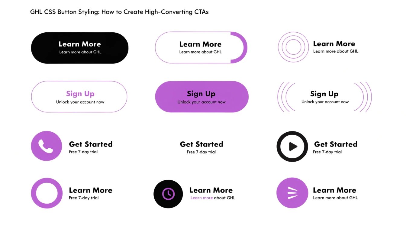
GHL CSS Button Styling: How to Create High-Converting CTAs
Are you tired of the standard, “blocky” buttons in GoHighLevel (GHL)? While the GHL builder is powerful, the button styles can sometimes look dated. By using GHL CSS, you can add glow effects, gradients, and animations that grab your visitor’s attention.
In this guide, we will show you how to transform your buttons into premium assets that drive more clicks. To make sure you are targeting the right buttons, first check our guide on GHL CSS Selectors.
Why Custom Button Design Matters
Your button is the final step in your funnel. If it looks boring, users might ignore it. A well-designed button tells the user exactly where to click. It builds “visual hierarchy,” which is a fancy way of saying it makes the most important thing on the page stand out.
Benefits of Custom Buttons:
Where to Add CSS for GHL Buttons
You can add button CSS in two places:
Standard GHL Buttons vs. Custom CSS Buttons
| Feature | Standard GHL Button | Custom CSS Button |
| Shape | Square or Slightly Rounded | Pills, Circles, or Custom Angles |
| Shadows | Basic Drop Shadow | Soft Glow or Neumorphic Depth |
| Animation | None | Pulsing, Shaking, or Color Shifts |
| Gradients | Single Color | Multi-tone Brand Gradients |
Top GHL CSS Snippets for Buttons
Copy these codes into your CSS box to see instant results.
The “Glow” Effect
This makes your button look like it is glowing from behind.
CSS
.elButton {
  box-shadow: 0 0 20px rgba(124, 58, 237, 0.6) !important;
  border: none !important;
}
Gradient Background with Hover
This changes the color smoothly when a user hovers over the button.
CSS
.elButton {
  background: linear-gradient(90deg, #4F46E5, #7C3AED) !important;
  transition: 0.5s !important;
}

.elButton:hover {
  background: linear-gradient(90deg, #7C3AED, #4F46E5) !important;
  transform: translateY(-3px) !important;
}
The “Pulse” Animation
This makes the button grow and shrink slightly to attract the eye.
CSS
@keyframes pulse {
  0% { transform: scale(1); }
  50% { transform: scale(1.05); }
  100% { transform: scale(1); }
}

.elButton {
  animation: pulse 2s infinite !important;
}
Best Practices for Button Design
Keep the Text Short
A button should say something simple like “Get Access” or “Join Now.” If the text is too long, the CSS might make the button look messy on smaller screens.
Use High Contrast
Your button color should be the opposite of your background. If your page is white, use a bright blue or green button. This makes it impossible to miss.
Focus on the “Hover” State
In 2026, users expect websites to be interactive. Adding a small movement or color change when a mouse hovers over a button makes your site feel more “expensive” and professional.
Frequently Asked Questions (FAQs)
Can I change only one button and not all of them?
Yes. Give your button a “Custom Class” in the GHL editor (e.g., my-special-button). Then, in your CSS, use .my-special-button instead of .elButton.
Will these buttons work on my mobile funnel?
Yes. However, hover effects don’t work on touchscreens. Make sure the button looks good even without the hover animation.
Do I need to use !important for buttons?
Yes. GHL has very strong default styles for buttons. Using !important ensures your custom colors and shapes actually show up.
Conclusion
Customizing your GHL buttons with CSS is one of the fastest ways to improve your funnel’s design. You don’t need to be a developer to add a simple glow or a smooth hover effect. Start with one of the snippets above and watch how it changes the feel of your entire page.