GHL Calendar Design: How to Style Your Booking Page for More Appointments
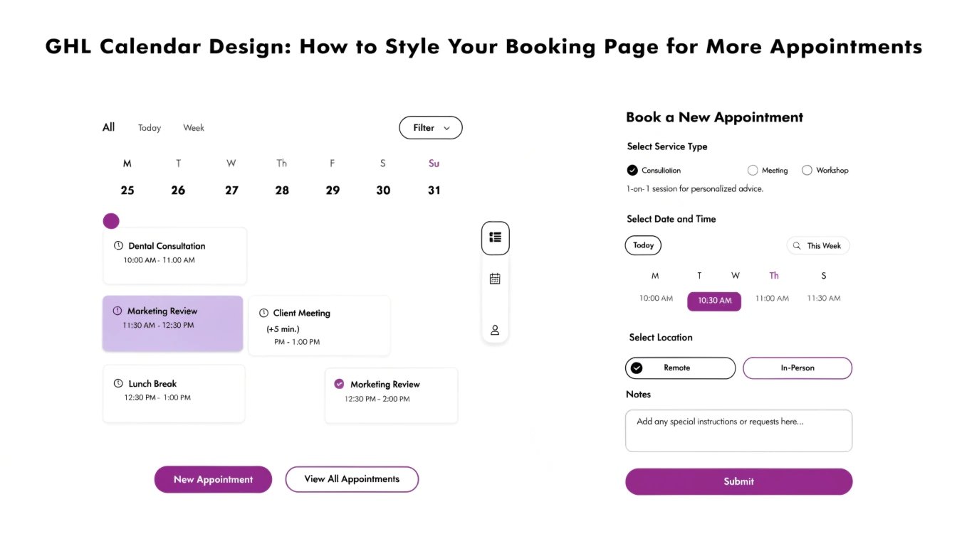
Is your GoHighLevel (GHL) calendar looking a bit plain? For a coach or consultant, the booking page is your “virtual handshake.” If the calendar looks confusing or generic, prospects may hesitate to book a discovery call. By using GHL CSS, you can customize the colors, round the date pickers, and create a sleek “booking card” layout.
In this guide, we will show you how to transform the standard GHL calendar into a professional scheduling tool. Once your calendar is styled, you can ensure the rest of your funnel matches by following our guide on .
Why Calendar Design Affects Your Show-Up Rate
A professional booking page reduces “buyer’s remorse” before the call even happens. If the experience feels premium, the lead is more likely to respect your time and show up for the appointment.
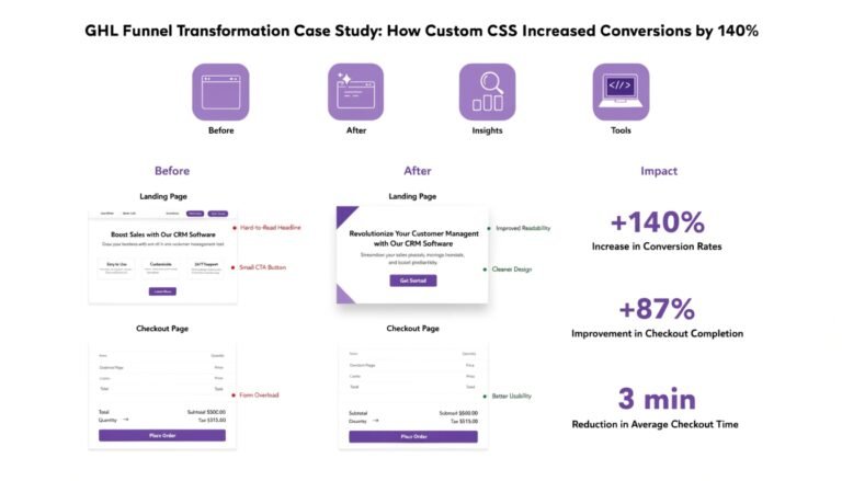
Read this: GHL Order Form CSS: How to Style a Premium Checkout Experience
Benefits of Custom Calendar CSS:
- Brand Alignment: Match the calendar colors exactly to your logo.
- Mobile Ease: Ensure the date and time slots are easy to tap on a smartphone.
- Reduced Friction: Highlight the “Available” slots so they stand out immediately.
- Clean Layout: Use to make the calendar container float elegantly over your background.
Standard GHL Calendar vs. Custom CSS Calendar
| Feature | Standard GHL Calendar | Custom CSS Calendar |
| Date Pickers | Square & Basic | Rounded & Modern |
| Active Date | Default Blue | Your Primary Brand Color |
| Time Slots | Simple List | Styled “Action” Buttons |
| Mobile UX | Standard Stacking | Optimized Layout |
3 Essential CSS Snippets for GHL Calendars
Copy and paste these snippets into your Calendar Settings > Custom Code (or the Page CSS where the calendar is embedded).
1. Round the Date and Time Buttons
This removes the “boxy” look and makes the interface feel more like a modern app.
2. Highlight the “Selected” Slot
Make it very obvious which time the user has clicked by adding a subtle glow.
3. Customize the “Continue” Button
Your booking button should look just as good as your on your sales page.
Best Practices for Booking Page UX
Remove Distractions
A booking page should have one goal. Remove your main navigation menu so the user doesn’t get distracted and click away before finishing the booking.
Use a “Split” Layout
On desktop, place your bio or a short testimonial on the left and the calendar on the right. This reminds the user why they are booking the call while they look for a time slot.
Optimize for “The Thumb”
Most users book calls while on their phones. Ensure your settings allow the “Confirm” button to be easily reached with one hand.
Frequently Asked Questions (FAQs)
Can I change the font of the calendar?
Yes! By using the @import method in our guide, you can apply your brand’s typography to the entire calendar.
Does this work for both the “Classic” and “Neo” calendars?
These snippets are primarily designed for the newer GHL calendar versions. If you are using an older version, you may need to find specific .
Will this slow down my booking page?
No. CSS is extremely lightweight. It will not affect how fast your availability loads from Google or Outlook.
Read this: GHL Opt-In Page Design: 7 Best Practices for High-Converting Forms
Conclusion
Your GHL Calendar is the gateway to your coaching sales. By applying a few simple CSS tweaks, you can move away from a “default” look and provide a booking experience that reflects your high-ticket value. Start by updating your brand colors today and watch your appointment numbers climb!