GHL Order Form CSS: How to Style a Premium Checkout Experience
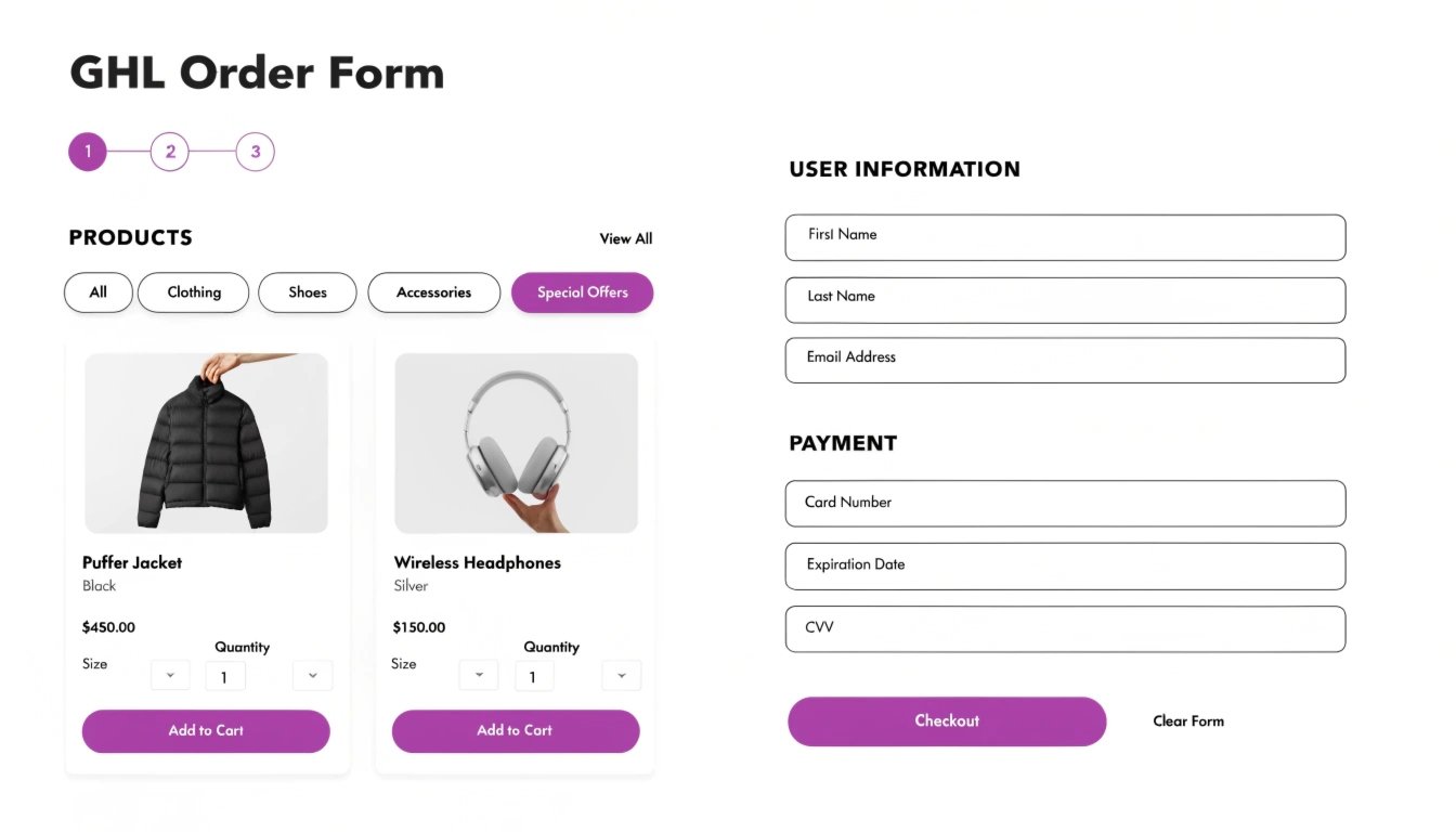
Do you want your GoHighLevel (GHL) checkout page to look like a high-end e-commerce site? The standard GHL order form is functional, but it can look a bit “boxed-in.” By using GHL CSS, you can clean up the input fields, customize the “Complete Order” button, and add trust signals that reduce cart abandonment.
In this guide, we will show you how to transform your 1-step and 2-step order forms. This is a critical final step in your funnel, especially after you’ve optimized your .
Why Checkout Design is the Key to Revenue
The checkout page is where the most “friction” happens. If the form looks outdated or confusing, the user might hesitate to enter their credit card details. A polished, branded order form creates a “seamless” transition from your sales page to the final purchase.
Read this: GHL Opt-In Page Design: 7 Best Practices for High-Converting Forms
Benefits of Custom Order Form CSS:
Standard Order Form vs. Custom CSS Order Form
| Feature | Standard GHL Form | Custom CSS Order Form |
| Input Fields | Default grey borders | Soft shadows & brand-colored focus states |
| Button | Standard “Complete Order” | Animated |
| Product List | Simple text | Highlighted “Offer Boxes” with icons |
| Mobile View | Standard stacking | Optimized spacing |
3 Essential CSS Snippets for Order Forms
Copy and paste these snippets into your Page Settings > Custom CSS to give your checkout a professional lift.
1. Highlight the “Order Summary” Box
This helps the user see exactly what they are buying by adding a subtle background color and border.
2. Make the “Complete Order” Button Pulse
An animated button draws the eye to the final action, increasing the chance of a successful sale.
3. Customize Input Field Focus
Make it clear which box the user is typing in by adding a branded “glow” to the active field.
Read this: How to Make Your GHL Funnel Look Professional (Even If You Are Not a Designer)
Best Practices for Checkout UX
Simplify the Header
Remove the main navigation from your checkout page. You don’t want users clicking away to your “About Me” page when they should be finishing their purchase.
Use High Contrast for the “Price”
The total price should be bold and easy to find. If you have multiple items, use CSS to make the “Total” line stand out with a slightly larger font size.
Add “Visual Proof” Nearby
Place a testimonial or a “Money Back Guarantee” icon right next to the order form. You can use to style these trust elements so they look modern and clean.
Frequently Asked Questions (FAQs)
Can I style 1-step and 2-step order forms differently?
Yes. You can use specific to target only the .ghl-2-step-order class or the .ghl-order-form class.
How do I hide the “Coupon Code” box if I don’t need it?
If you aren’t using coupons, you can hide that specific div using display: none; to keep the form as short as possible.
Is it safe to use CSS on payment forms?
Yes. CSS only changes the “look” of the form. It does not touch the secure credit card processing handled by Stripe or PayPal.
Conclusion
Your GHL Order Form is the most valuable part of your funnel. By spending just a few minutes adding rounded corners, branded buttons, and clear spacing, you can significantly lower your cart abandonment rate. Start with a simple button color change today and watch your revenue grow!