Why Your GHL Funnel Looks Cheap (And How to Fix It in 20 Minutes)
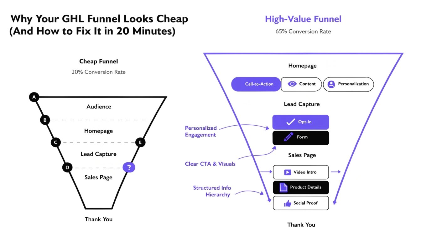
You’ve seen them: the high-ticket coaches with funnels that look like $100k-per-month businesses. Then you look at your GoHighLevel (GHL) funnel, and it feels… off. It looks like a template. It looks “boxy.” In short, it looks cheap.
When a prospect lands on a “cheap-looking” page, their brain subconsciously lowers the value of your offer. If you want to charge premium prices, you cannot have a bargain-bin website. In this guide, we’ll identify the five main reasons your funnel is hurting your brand and how to use GHL CSS to fix them in under 20 minutes.
The “Default Gray” Syndrome
GHL templates often use a standard gray border or background for sections. This is the #1 sign of an amateur build. High-end brands use “Off-Whites” or custom brand-specific grays.
The Fix:
Change your section backgrounds to a very light brand tint. Instead of #cccccc, try a soft, modern color that matches your brand identity. You can find more tips on this in our guide on .
Read this: GHL Custom CSS for Non-Coders: The Ultimate No-Fear Guide (2026)
Clashing Typography
Many coaches use too many different fonts, or worse, they use the default system fonts (Arial, Times New Roman). This makes the text look like an unformatted Word document.
The Fix:
Limit yourself to two fonts. Use a bold, unique font for your headlines and a clean, readable font for your body text. If the standard GHL list isn’t enough, follow our to import Google Fonts that scream “Authority.”
“Boxy” Buttons and Forms
Standard GHL elements are square and flat. In 2026, premium design is about soft edges, subtle shadows, and interactive depth. Square buttons look like they were designed in 2012.
The Fix:
Add rounded corners and a soft shadow to your buttons.
For more advanced button tricks, see our .
Lack of White Space
Cheap funnels try to cram as much information as possible into a small space. This creates a “cluttered” feeling that overwhelms the visitor. Professional design uses “White Space” (or negative space) to guide the eye.
The Fix:
Increase the padding in your sections. Give your headlines room to breathe. Use our to target the .inner class and add at least 80px of padding to the top and bottom of your main sections.
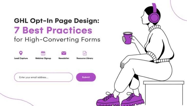
Generic Form Design
Nothing says “I’m using a template” like a standard white form with gray borders. Your lead capture is the most important part of your page—it should look like a custom-designed experience.
The Fix:
Use to give your forms a modern, “frosted glass” look. This makes the form feel like a premium tool rather than a chore to fill out.
Design Comparison: Cheap vs. Premium
| Element | The “Cheap” Look | The “Premium” Look |
| Colors | Default Primary Colors | Custom Brand Palettes |
| Shadows | None or Heavy Black | Soft, Diffused “Ambient” Shadows |
| Borders | Hard 90-degree Corners | Smooth 8px to 50px Curves |
| Fonts | Arial / Roboto | |
| Buttons | Flat and Static |
The 20-Minute “GHL Facelift” Checklist
If you are in a rush, follow these three steps to immediately de-cheapen your funnel:
- Round Everything: Add
border-radius: 12px !important;to your sections, rows, and buttons. - Fix Your Headline: Increase the
letter-spacingandline-heightso it doesn’t look like a block of text. - Soften the Shadows: Change any hard black shadows to a light
rgba(0,0,0,0.05).
When to Move Beyond DIY
If you’ve tried these fixes and your funnel still doesn’t feel like a “Category King,” it might be time for a professional touch. Our is a low-ticket service designed to take your “Cheap” funnel and turn it into a high-converting masterpiece in just 48 hours.
Read this: GHL Calendar Design: How to Style Your Booking Page for More Appointments
Frequently Asked Questions (FAQs)
Why does my funnel look different on mobile?
Usually, this is because the font sizes are too large for small screens. Check our for the exact media queries to fix this.
Can I fix a “cheap” funnel without using CSS?
You can improve it using the GHL editor, but to get a truly premium, “non-GHL” look, you will eventually need small snippets of custom code.
Does a custom-styled funnel load slower?
Actually, clean CSS can often replace heavy images or background videos, making your funnel load faster than a standard one.
Conclusion: Perception is Reality
In the world of online coaching, your design is your credibility. You only have one chance to make a first impression. By removing “default” elements and adding custom branded touches, you move your business from “another GHL user” to a “premium authority.”
Don’t let a cheap-looking funnel be the reason you lose your next $5,000 client. Pick one section today and apply the fixes we’ve discussed!